Overview
Redesign Cash App “Venmo”
My Role: UX Researcher
Collaborators: Ferris Yeh, Hamna Khan, Nicholas Peterson, Robert Correa, Yeji Shin
*This is a school project with no affiliation with Venmo

Data Collection and Tasks
Our initial step was discussing our own experiences with the app. Then taking a step back and creating some tasks and while utilizing the “master-apprentice” model to discover what are the actual problems users are facing to develop relevant tasks.
The first task we wanted to observe the steps the interviewee’s took to find a specific Venmo account when only provided with the full name. We closely observed their actions as they searched for the person and selected the proper profile.
The second task was a bit more complex, where we created a fake receipt. We asked the interviewees to split the total shown on the receipt and request the amount to each one of our members (given the full name and Venmo username). In this scenario, we wanted to observe how users interacted with Venmo in a group setting and what steps they took in order to complete this task.
This was a step I had a big role in, which involved finding user test subjects and conducing these tasks. Interviewees were found around the UCSD campus. I would work with the users, while another group member took notes on the interactions.

The Problems
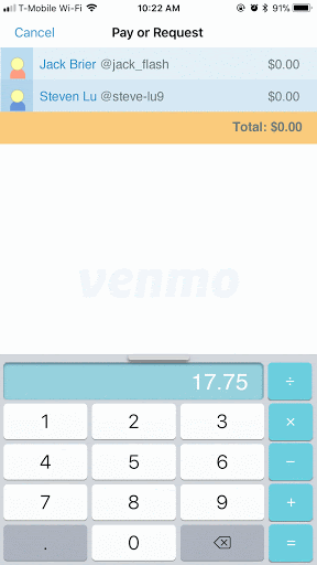
Nearly all of our interviewees was that many people either did not know about or use the calculator function within the Venmo app. Instead they exited the app to use another calculator when finalizing the total amount.
There was discover ability errors when finding the calculator existed in app. No “=” and choice of colors makes the function seem unimportant. (seen on left)
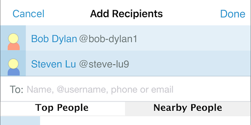
Searching for new users resulted in many errors
Venmo shows a global feed and a friends’ feed, where the user can see transactions between people in the area, or the transactions of their Venmo friends.
This lead to users feeling like the app was less secure or lacked privacy concerns
Others felt it was a waste of space and didn’t use or care for this function

The Redesign
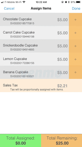
On the left was our redesign of the pay/request screen, which we added icons for a calculator and a optimistic feature of image scanning a receipt. The icon was added so users were able to easily discover the features and request multiple users different prices on the same screen.
On the right is our redesign of finding users to pay/request in which we show the username along with a profile image to provide additional feedback to increase a sense of security and limit errors. We have also added frequent users and a “Nearby People” function to address the social aspect in a better manner, more in line with user’s actual use (splitting a dinner bill)
Prototypes